Physical Address

304 North Cardinal St.
Dorchester Center, MA 02124

Scatter plot showing a positive linear relationship between hours of study and exam scores, illustrating linear regression.

Understanding Linear Regression: A Beginner’s Guide

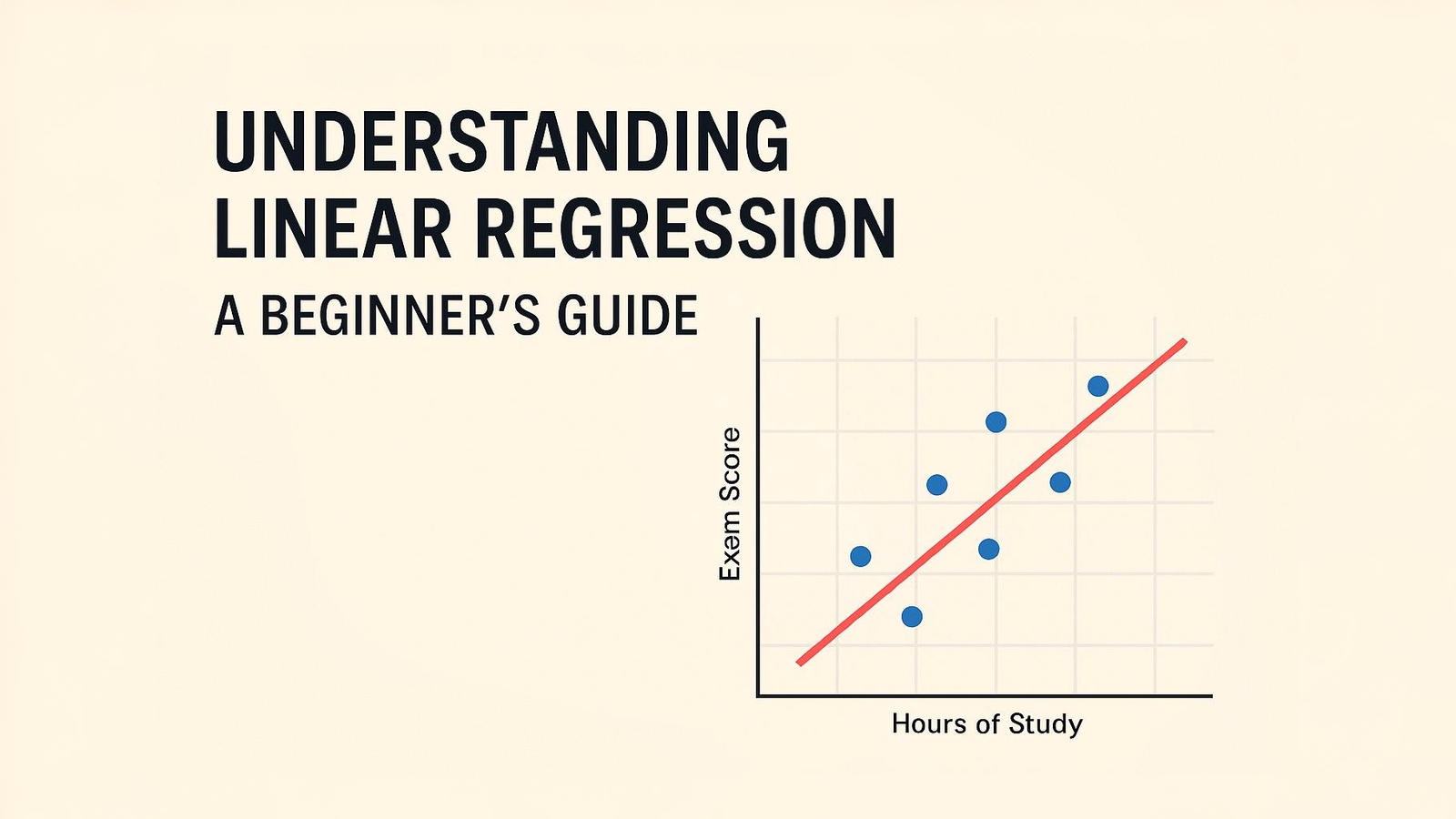
Ever wondered how analysts predict house prices or sales figures? Linear regression is the foundational technique behind many predictions we encounter daily. This guide breaks down the concepts, formulas, and applications in plain language with practical examples—no advanced math degree required!

Linear regression is one of the most fundamental and widely used statistical methods in data analysis. Whether you’re interested in predicting sales, understanding relationships between variables, or just beginning your data science journey, linear regression provides an excellent starting point. In this guide, we’ll break down this powerful technique into digestible concepts that anyone can understand.

What is Linear Regression?

At its core, linear regression is about understanding relationships. Specifically, it helps us understand how one variable (let’s call it X) relates to another variable (Y). The goal is to find the best straight line that describes this relationship, allowing us to make predictions.

A scatter plot on a black background shows several blue data points that approximate a linear relationship. A red line of best fit passes through the points, and the equation y=mx+b is labeled in red near the upper right of the line.
Scatter plot showing data points and the line of best fit with the equation y=mx+b

Think of linear regression like drawing a “line of best fit” through a set of data points. This line helps us:

  • Understand the relationship between variables
  • Make predictions for new data points
  • Quantify how changes in one variable affect another

The Basic Formula

The formula for a simple linear regression line is:

Y = β₀ + β₁X + ε

Where:

  • Y is the dependent variable (what we’re trying to predict)
  • X is the independent variable (what we use to make predictions)
  • β₀ is the y-intercept (where the line crosses the y-axis)
  • β₁ is the slope (how steep the line is)
  • ε (epsilon) represents the error term
A graph on a black background shows a red line with a positive slope passing through the points (200, 150) and (300, 200). A blue dashed right triangle connects these points, illustrating the rise of 50 and the run of 100. The equation of the line, y=0.5x+50, is labeled in red.

A Real-World Example

Let’s make this concrete with an example: predicting house prices based on square footage.

Imagine you’re a real estate agent with data on recently sold homes. You want to understand how square footage affects the selling price.

A scatter plot on a black background shows several blue data points trending upwards, suggesting a positive linear relationship. A red line of best fit is drawn through the scatter of points
Data points displayed with a linear trend line

In our example:

  • Y = House price (dependent variable)
  • X = Square footage (independent variable)
  • β₀ = Base price of a home (when square footage is 0)
  • β₁ = How much each additional square foot adds to the price

Let’s say our analysis gives us: Y = $50,000 + $100X

This means:

  • A theoretical house with 0 square feet would cost $50,000 (the y-intercept)
  • Each additional square foot adds $100 to the price (the slope)

So we could predict:

  • A 1,000 sq ft house would cost: $50,000 + $100(1,000) = $150,000
  • A 2,000 sq ft house would cost: $50,000 + $100(2,000) = $250,000

How Does Linear Regression Work?

How do we find the “best” line? Linear regression uses a method called “Ordinary Least Squares” (OLS).

A graph illustrating the Ordinary Least Squares (OLS) method. Blue data points are scattered around a red regression line. Yellow dashed vertical lines represent the residuals, connecting each data point to the line. Boxes explain that the method minimizes the sum of squared residuals, Σ(y− y ^ ​ ) 2 , and show an example of squaring a residual (e=2 becomes e 2 =4). The axes are labeled "X (Independent Variable)" and "Y (Dependent Variable)"
Visual explanation of the Ordinary Least Squares method for linear regression, showing data points, the regression line, and the concept of minimizing the sum of squared residuals.

The process works by:

  1. Drawing a potential line through the data
  2. Measuring the vertical distance from each data point to the line
  3. Squaring these distances (to make all values positive and penalize large errors)
  4. Adding up all squared distances
  5. Finding the line that gives the smallest total (the “least squares”)

Assessing How Good Our Line Is

Not all regression lines are created equal. We need ways to measure how well our line fits the data:

  1. R-squared (R²)
    • Ranges from 0 to 1
    • Closer to 1 means a better fit
    • Represents the percentage of variation in Y explained by X
Two side-by-side scatter plots comparing regression models. Left plot shows points closely aligned with a line (high R²), right plot shows widely scattered points (low R²).
Comparing high R² (left) vs. low R² (right) regression models
  1. Residual Analysis
    • Residuals are the differences between predicted values and actual values
    • Ideally, residuals should be randomly distributed around zero

Multiple Linear Regression

The real power of linear regression comes when we extend beyond just one independent variable. Multiple linear regression allows us to use several variables to make predictions.

The formula expands to: Y = β₀ + β₁X₁ + β₂X₂ + β₃X₃ + … + βₙXₙ + ε

3D-style plot showing a light blue plane fitted through red data points, representing multiple linear regression with two independent variables